Contrast-Aware Shiki Code Blocks on Dark Editorial Panels
Shiki themes inherit assumptions about their original backgrounds. Here is how I remapped GitHub Dark colors to semantic CSS variables, kept highlighting on the server, and measured the result on the site’s real navy panels.
- Published
- July 9, 2026
- Updated
- Updated July 13, 2026
- Author
- Daniel Mark
- Reading time
- 9 min read
On my site, code blocks sit on dark navy panels inside otherwise light editorial pages. Shiki's github-dark theme looked fine at first, but syntax colors do not exist in isolation. Their contrast depends on the surface behind them.
GitHub Dark assigns #6a737d to comments. My code panels use --sidebar, which resolves to #0b1422 on the default light canvas. That combination measures 3.83:1. WCAG 2.2 AA requires 4.5:1 for normal-sized text, so comments fell below the target.
I did not want syntax colors to remain an accidental property of an upstream theme. I kept Shiki for tokenization, translated its theme colors into semantic CSS variables, and rendered the resulting tokens on the server. Shiki still identifies the code. The site decides how that code should look on its actual surfaces.
The rendering pipeline
Authors do not insert React components into MDX. They add a Code snippet block in Payload's Lexical editor. The block stores the filename, language, source, optional line annotations, and toggles for the language label and copy button.
When Next.js renders a post, the stored Lexical JSON moves through this path:
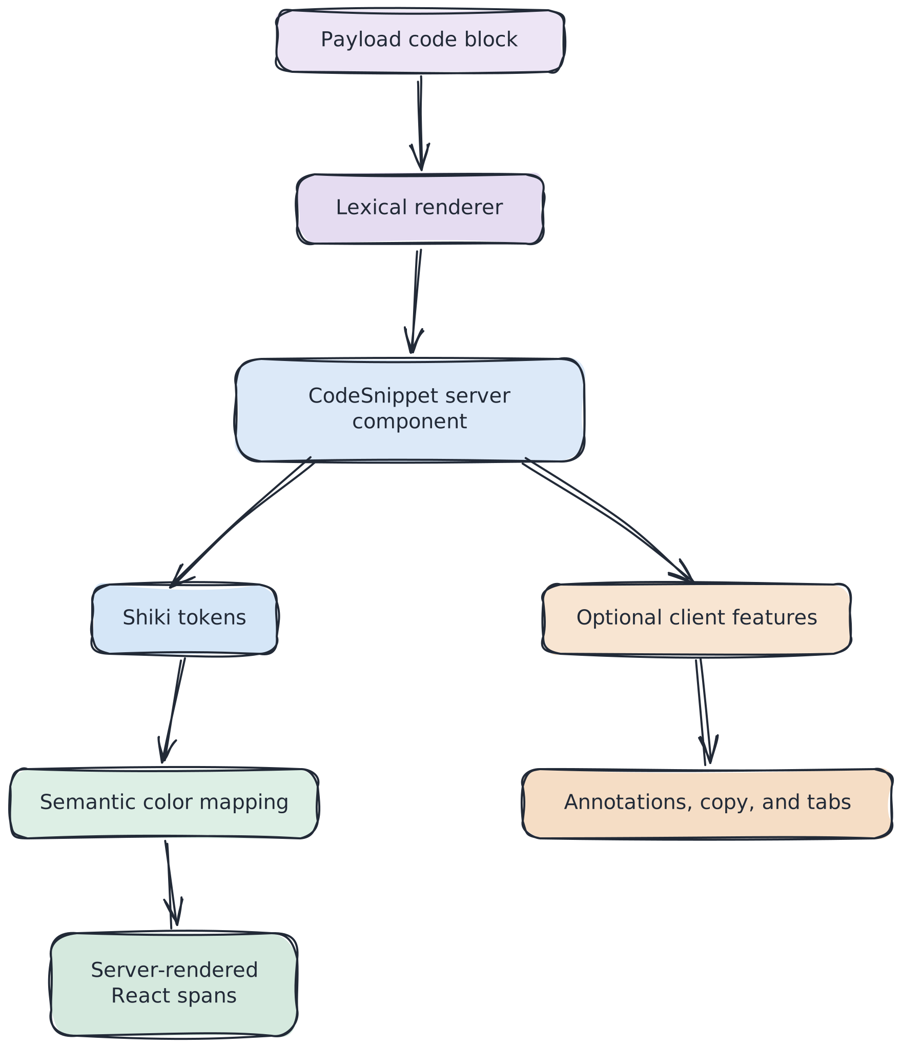
RichTextRenderer registers the code-snippet converter, parses the Payload fields, and renders CodeSnippet. The same server component also supports inline Lexical code nodes, tabbed examples, and statement blocks.
CodeSnippet preprocesses line-highlight markers, calls highlightCodeLines, and assembles a <figure> containing the code panel. It does not accept an HTML string from codeToHtml. The renderer consumes Shiki tokens and creates React spans itself, applying the final token color along the way.
The client boundary appears only when a snippet needs interaction:
- Line annotations mount CodeSnippetInteractive and a Radix Dialog.
- An editor-enabled copy control mounts
CopyCodeButton. - Tabbed examples pass their server-rendered panels to
CodeTabsClient.
A plain article snippet without annotations or a copy button adds no code-block-specific client JavaScript.
Published posts use static generation with a one-hour revalidation interval. Highlighting therefore runs as part of the server render that produces the cached page, rather than in each reader's browser. I have not benchmarked this against a client highlighter. The concrete benefit is architectural: Shiki, its grammars, and its theme data stay out of the client bundle.
Keeping Shiki on the server
The highlighting module starts with import "server-only", making the boundary explicit. The site currently uses Shiki 4.2 and creates a module-level highlighter promise:
The registered set runs from plain text and the usual web languages through Solidity, Rust, Go, and Python. Reusing the promise avoids constructing a highlighter for every snippet in the same Node process.
highlightCodeLines calls codeToTokens with github-dark. Each returned ThemedToken becomes a React span. If highlighting fails, the component returns uncolored plain lines instead of failing the article render.
That fallback matters because syntax highlighting is presentation, not content availability. A missing grammar should make the code less colorful, not make the post unreadable.
Moving syntax colors into the design system
The semantic variables live in code-tokens.ts:
The code-panel scope provides their actual values:
resolveCodeTokenColor maps known github-dark values to those semantic variables:
The important integration point is tokenStyle inside the highlighter. It calls the resolver for every Shiki token before React creates the span:
This turns the design system into the final color authority. Changing --code-comment updates every mapped comment without changing the Shiki configuration or the rendering component.
Measuring the colors on the real panels
The default light canvas resolves --sidebar to #0b1422. On the dark canvas it resolves to the slightly darker #070d18. The table uses the WCAG relative-luminance formula against both surfaces.
Role | Token color | Light-canvas panel | Dark-canvas panel | AA for normal text |
|---|---|---|---|---|
Original GitHub Dark comment |
| 3.83:1 | 4.04:1 | Fail |
Remapped comment |
| 7.68:1 | 8.09:1 | Pass |
Foreground |
| 16.46:1 | 17.33:1 | Pass |
Keyword |
| 6.95:1 | 7.32:1 | Pass |
String |
| 10.94:1 | 11.52:1 | Pass |
Constant and function |
| 8.89:1 | 9.37:1 | Pass |
Entity |
| 7.29:1 | 7.67:1 | Pass |
Variable |
| 9.94:1 | 10.48:1 | Pass |
Tag |
| 12.33:1 | 12.99:1 | Pass |
The comment remap fixes the actual contrast failure. Most other mapped colors already cleared 4.5:1, but expressing them semantically gives the system one place to own and review the palette.
Choosing what happens to unknown colors
When Shiki emits a color absent from the map, the resolver returns the original hex value. That is graceful degradation, not contrast enforcement.
- Passing the color through preserves syntax distinctions when the upstream theme introduces a value I have not mapped.
- Falling back to the foreground would favor readability but flatten some distinctions.
- Testing every emitted color against the panel background could catch new failures automatically, but the repository does not do that today.
The current choice keeps highlighting intact while accepting that an unknown token color has not been audited. The table above covers the semantic palette, not every future value Shiki might emit.
Why use a local resolver?
Shiki already supports colorReplacements, custom themes, and CSS-variable themes. Because this component consumes codeToTokens and renders React spans itself, the final rendering boundary is also a convenient place to translate Shiki colors into design-system variables.
The local resolver is not inherently more correct than Shiki's built-in replacement facilities. Its advantage in this codebase is visibility: the mapping is a small pure function with direct unit tests, and the React renderer already has to inspect every token. A future refactor could move the same policy into colorReplacements without changing the central idea.
Payload line annotations
The CMS calls annotations Blips. In the public interface they appear as optional + buttons attached to specific one-based line numbers. Activating one opens a dialog containing a short explanation and, optionally, a link.
When annotations exist, CodeSnippet wraps the panel with CodeSnippetInteractive. Each trigger uses the annotation label as its aria-label, displays a decorative plus icon, and opens a Radix Dialog.
The current implementation is not the end of the accessibility story. Radix manages focus trapping, Escape handling, and focus return, but the dialog content does not render Dialog.Title or establish an equivalent accessible name. Until that is corrected and tested, I treat annotation-dialog accessibility as incomplete.
Without JavaScript, the highlighted code remains readable, but the annotation buttons cannot open their explanations. The base snippet therefore degrades safely while the annotation experience itself still depends on JavaScript. I have not yet used annotations in a published post, so they remain an optional CMS capability rather than a dependency of the editorial format.
Where contrast awareness stops
Color contrast is only one part of accessible code presentation. The current component uses a <figure> with an optional <figcaption>, but the highlighted source is rendered as a div line grid rather than <pre><code>. Screen-reader traversal and preservation of code semantics therefore need further review.
Wide code uses an internal horizontal scroll container. A Playwright fixture verifies that it remains inside the panel instead of expanding the document. That test does not verify keyboard scrolling or cross-browser focus behavior.
The copy button is in better shape. It exposes state-specific labels for copying, success, and failure; hides decorative icons; and has tests for clipboard behavior. Reduced-motion styles disable its transitions when the reader requests them.
These boundaries are why I describe the implementation as contrast-aware, not as proof that the complete component is accessible.
Testing the guarantees that matter
Test area | What it verifies | What it does not verify |
|---|---|---|
| Known colors map to semantic variables; unknown colors pass through; missing colors use the foreground | Computed contrast or rendered appearance |
| Language normalization and Payload field parsing | Highlighted output |
| Structure, escaping, dark-panel attributes, and default chrome | Real Shiki colors because the highlighter is mocked |
| Accessible labels and clipboard success or failure | Full-page interaction |
| Highlight markers and ranges are removed correctly | Whether emphasis has sufficient non-color cues |
| Fixture rendering, contained overflow, and copying in Chromium | Annotation dialogs, keyboard scrolling, and cross-browser behavior |
Unit tests make the mapping deterministic. The contrast table checks the current resolved colors. Neither replaces semantic, keyboard, or assistive-technology testing.
Content Security Policy and inline colors
The site does not currently send a Content Security Policy header, so the renderer's style={{ color: ... }} attributes are allowed. A stricter policy would make that decision visible.
A nonce on a <style> element does not authorize the style="" attributes attached to individual token spans. CSP Level 3 controls those through style-src-attr. Supporting a policy that blocks inline style attributes would require either permitting them deliberately or moving token colors into classes.
Shiki offers transformerStyleToClass for class-based output, but this repository does not use it and currently renders tokens through React rather than Shiki's HTML pipeline. A future CSP hardening pass would therefore need either a class-based React renderer or a change in highlighting pipeline.
Tradeoffs
Exact-color mapping couples the site to github-dark. If an upstream theme release changes a hex value, that color passes through until the table is updated.
Unknown-color passthrough favors continuity over enforcement. The code stays highlighted, but new colors are not automatically measured.
Inline styles are convenient but constrain future CSP policy. Moving to classes would make a stricter style-src-attr policy easier to adopt.
Interaction remains proportional. Plain snippets remain server-rendered markup. Copying, tabs, and annotations add client components only when an editor enables them.
The reusable lesson
A syntax theme is an input. The application's design system owns the colors readers actually see and the contrast requirements those colors must meet against the real surface.
In this implementation, Shiki tokenizes the code on the server. A small resolver translates known theme colors into semantic CSS variables. The code panel supplies the final values, and measured contrast verifies those values against both navy backgrounds.
That resolver is the contract point: tokenization from Shiki, presentation from CSS, and contrast policy from measured values on the actual panel. Copying, tabs, and annotations remain optional layers on top of the static highlighted output.
That is the split I would reuse for the next dark-panel technical blog.